Diff Window Tab characters
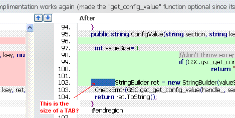
This could a wish list item or a bug with the "difference" window. But the tab character gets displayed in a way that makes it very unlikely to represent what you would see in a IDE. If you never use TABs then I think it would look fine but in my case we use TABs and the display always looks staggered.
I noticed two issues:
It defaults to being 12 space characters and most developers use 2 or 4 characters. This TAB size should be configurable.
It doesn't align on consistant TAB stops. Even in NOTEPAD.EXE if you have two space + one tab it moves to the same location as one tab.
Thanks,
Steve
Edited by: Steve Waggoner on May 21, 2008 1:53 AM
Attachment(s):
TC_Diff.GIF
Please sign in to leave a comment.
I filed this as http://jetbrains.net/tracker/issue/TW-5115
Steve Waggoner wrote:
--
Alexey Gopachenko
JetBrains Inc.
http://www.intellij.com
"Develop with pleasure!"